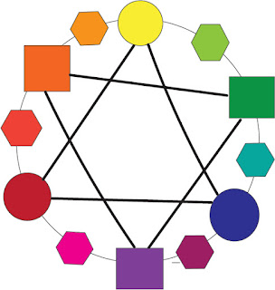
Colors!
Me with Colors
My favorite color is red. I associate red with a memory of my volleyball team winning a tournament. I associate red with this memory because my team had red jerseys. I had not always liked the color red. I used to prefer a pale blue, but after I had won the volleyball tournament red was my favorite color. So when I see red I think of passion, drive, and happiness. I wish I could change my bedroom walls to red, but my mom won't let me. There are so many food products out in the world that are red such as Apples, McDonalds fry holders,tomatoes,ketchup, and so many more! Red is everywhere because it is bright and really stands out, but red can also be a shadow or a tint and still look amazing.
My least favorite color is yellow. I don't have any bad memories to associate with yellow. When I think of yellow I just think of disease and broken bones and its not fun. This color is everywhere due to the fact that it is a primary color but I wish it was not. I don't want to see the color yellow everywhere. The color is way too bright and when you add a shade or a tint to it it just looks even worse than before.
Color theory helix impacts graphic deign. Color theory helps us figure out what colors work really well together. Knowing what colors go well together is important because it can draw someones attention and get them interested in your work. Then boom you're in business. Color there is also important to know what colors clash with each other. Because if you put two colors together that shouldn't go together then it won't be pleasing to the eye. Then no one likes your graphic design and that would be versed. So it is very important to know and understand color theory as a graphic designer.

Comments
Post a Comment